Buttons and links
Give users clear actions with Button, Small button, Link, and Icon Button.
The Buttons group contains Button, Small button, Link, and Icon Button. Choose one primary action for a screen and make its purpose clear from its label.
Add and configure an action
- Add the button or link from Components → Buttons.
- Select it and configure its visible text, icon, and styling where available.
- Add an action for the event users will trigger.
- Choose the required destination, data operation, or interaction.
- Use Preview to verify the result.
For a short interaction, configure the selected element's action controls. For a longer sequence, choose More actions... to open the workflow canvas for that element.
Follow the same example from placing components to adding behavior. Choose a note to zoom in.
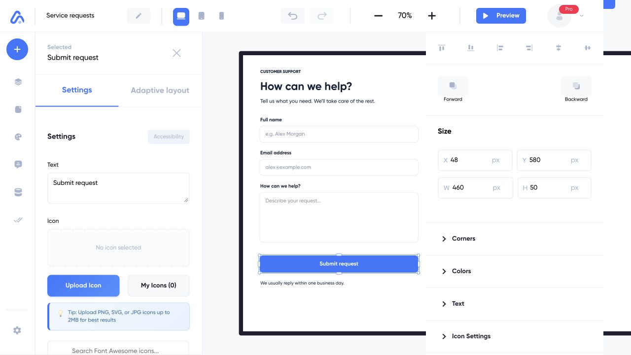
Selecting Submit request opens the controls for that button. The selection outline shows which element your changes affect.
Web interface captured on 5 Nov 2026 with example content. Choose a numbered note to take a closer look.
Match the label to the outcome
Use a label such as “Create request” for a saved record and “View details” for navigation. Do not show a success message before confirming the underlying operation worked.
An icon-only button should still have a recognizable purpose. Test it with a keyboard and make sure its meaning does not depend on color alone. If an action opens an outside website, review the URL and return path as part of testing.