Find your way around the editor
Know where screens, components, styling, actions, and publishing live in the web editor.
The app editor is the place to design an app's screens and connect their behavior. It is separate from the workspace sidebar containing Docs, Sheets, and other tools.
Open an app
Go to Apps and open a project. The editor displays your pages on a canvas, with tools on the left and controls for the selected element.
Follow the same example from placing components to adding behavior. Choose a note to zoom in.
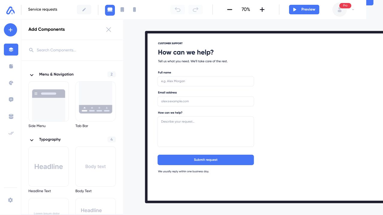
The example app is Service requests. Start with the component library, select an element on the canvas, then check its behavior in Preview.
Web interface captured on 5 Nov 2026 with example content. Choose a numbered note to take a closer look.
Use the main tools
| Tool | What it changes |
|---|---|
| Templates | Adds a blank or prepared screen |
| Components | Adds elements to a screen |
| Pages | Organizes and opens screens |
| Design | Shared colors and typography |
| Backend | App database and backend connections |
| AI Generator | Generates a component or page |
| Publishing | Builds the app for a selected platform |
| Project Settings | Project name, description, localization, and collaboration |
Select an element before editing its settings or adding an action. Select the page body to work with its screen rather than a particular child element.
Check your work
The top bar has Desktop, Tablet, and Mobile views, zoom controls, Undo and Redo, and Preview. Preview runs the app's interactions; switch back to Edit to continue arranging components.
Changing the device view helps inspect a layout. Use the element's adaptive controls when a property should change only at a particular size.